Brand Refresh
Esurance repositioning defined its mission as an insurer that uses technology and innovation to deliver a simple, transparent and affordable experience. This involved updating the website by changing fonts and creating a unique treatment for images on the homepage, product pages, and various other pages throughout the site. I led the project of setting up the new hierarchy and design of the homepage and product pages. I documented the elements in a UI design system file in Sketch to ensure brand consistency when all the designers work on creating new pages.
Explorations
After deciding on new fonts and colors, we experimented with the kind of imagery to use. We wanted to avoid photos that appeared too “stocky” but weren’t able to do a custom photoshoot. We settled on cutting out the images and having them isolated on the mint background. From there, we tested out what kind of imagery. People, objects, graphics and photos, situations relating to the product pages, etc. We stuck with the human element and chose photos that have a personality to them. A system of photo treatments were built out for how to display apps and images on insurance partner pages.
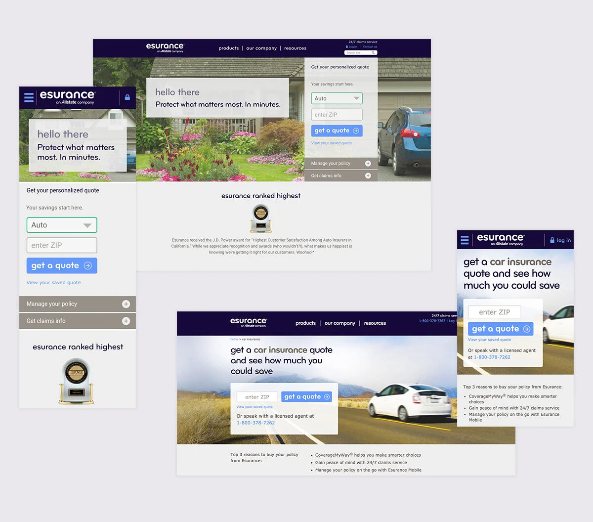
Old homepage and car product page designs.

Visual directions tested by user research and multivariate testing. The one on the right did the best so we got to work making that style work across our site.

Visual explorations of hero image treatments and body content layouts.
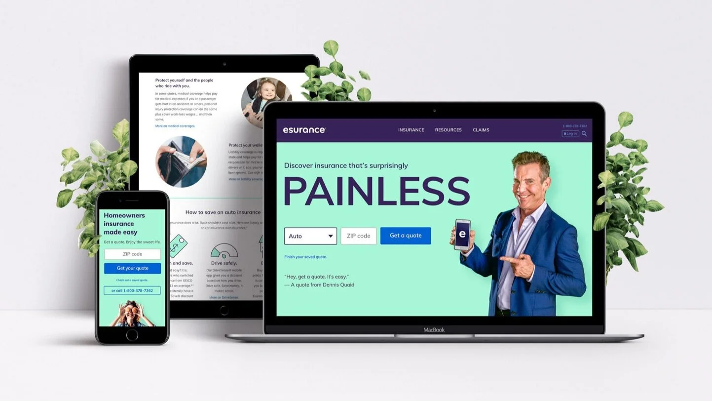
Final designs and results
The expanded color palette, the minimalist font face and the bright and clean illustration style supported the brand personality and expanded user interface and interaction design options. The rebrand had a positive impact on marketing KPIs, especially the unaided awareness (+4%), purchase intent (+3%) and quote completion rate. The users found the homepage and interactions based on redefined brand elements to be more clear and understandable.
UI Design System
I built and am maintaining a design system for the UI of the Esurance website. This includes font hierarchy, glyphs, button states and varieties, form fields, and other repeated elements with specs and uses for each to help maintain brand consistency. I built it in Sketch so designers can copy them as symbols to keep everything consistent.
